

 Photo by Mizuno K via Pexels
Delivery-Tile Food Photography
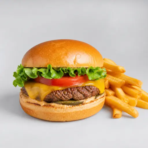
The delivery-tile style is not about mood — it is about winning the tap. Delivery marketplaces render every dish as a small square against a pale interface, and the photo that gets ordered is the one that reads instantly at that size. This look is engineered backwards from that constraint.
What defines a delivery-optimised tile
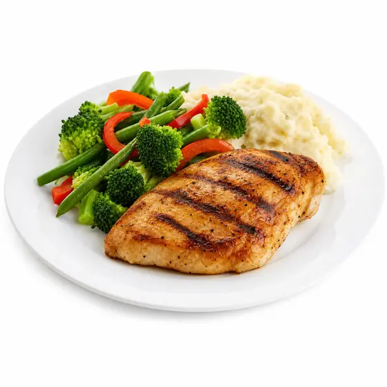
A single hero dish, centred and filling the frame so it survives aggressive cropping; high contrast against the platform's pale UI; punchy, appetising colour; and a clean, uncluttered background so nothing is lost when the image is shrunk to thumbnail scale. Props, negative space and arty framing all fail here — they disappear when the tile is 150px wide.
When to use it
Use it for every dish on Uber Eats, DoorDash, Deliveroo, Grubhub, Just Eat, Zomato, Swiggy and similar platforms. It is the workhorse style for the entire menu, not just heroes. For the exact pixel sizes each platform wants, see our delivery app photo requirements and per-platform specs.
Why it converts
On a delivery results page the user scans dozens of tiles in seconds. Centred framing means the dish is recognisable at a glance; high contrast means it stands out from the beige grid; and consistency across the menu signals a professional operation. Those three together are what move a browser to an order.
How to get it in the Studio
Photograph each dish quickly in any light, upload, and choose the delivery-tile preset. FoodPhoto.ai centres and re-crops the dish, lifts contrast and colour for small-screen impact, and cleans the background — then export at your platform's recommended size.