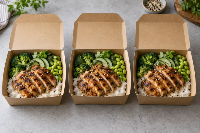
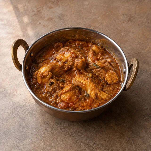
A delivery-app photo has two lives. On your own menu page it is a large image with room to breathe. In the customer's feed it is a small tile with a price badge, a rating chip, a promotion sticker or a delivery-time pill drawn over the corner. If the dish fills the whole frame, those overlays land on the food and the tile becomes unreadable.
Design the crop for the smallest tile and the busiest overlay. Leave deliberate margin around the dish, then check the result at real thumbnail size before you upload.
Quick answer
Frame the dish so the food sits inside the middle two-thirds of the image, with plain background margin on all four sides. Keep the most recognisable part of the dish, usually the top and the front edge, clear of the corners where platforms place badges. Then export the square crop the platform asks for and inspect it on a phone at roughly the size a customer sees in the feed.
Why the corners matter more than the centre
Platform interfaces reuse the same photo in several places: a large hero, a list tile, a search result, a cart line. The hero shows the whole frame; the tile crops and overlays. Corner content is therefore the first thing lost.
| Zone | What usually sits there | What to put there |
|---|---|---|
| Centre | Nothing added by the interface | The dish, the hero ingredient, the strongest texture |
| Top-left and top-right | Ratings, promotion chips, sponsor labels | Plain table, plain background, nothing you need the guest to read |
| Bottom-left and bottom-right | Price, delivery time, add-to-cart controls | Clean surface, no garnish, no cutlery you care about |
| Edges overall | Aggressive crop on some screens | Margin, so a tighter crop still leaves the plate whole |
This is a design problem, not a photography problem. You can solve it with framing before you ever press the shutter.
A framing recipe that survives every crop
- Give the plate margin. Pull back until there is visible table around the whole plate. If the plate touches two edges of the frame, you have no safe area.
- Centre the dish and accept a little empty space. Empty space is the safe area. A slightly looser frame that survives cropping beats a tight frame that loses its corners.
- Keep text-bearing props out. Menus, packaging with printing, receipts and branded napkins all create clutter that the interface will fight with. Remove them from the frame rather than trying to place them cleverly.
- Shoot a little wider than you need. Crop in the editor, where you can see the tile shape, instead of in the camera, where you cannot.
- Export one master, then per-platform crops. Keep the widest approved image as the master and derive square, 4:3 and 16:9 versions from it. Never re-edit from a crop.
Our thumbnail playbook covers the same idea from the editing side, and the platform-by-platform sizes are collected in the delivery-app photo size checker.
Checking the crop at real size
The most common mistake is approving a crop on a 27-inch monitor. Do this instead:
- Open the image on a phone, at arm's length, in the app or in a gallery.
- Squint, or blur the image slightly, and ask what the dish is. If you cannot tell, the tile is doing no work.
- Cover the four corners with your thumbs to simulate badges. Whatever your thumbs hide is what a customer will not see.
- Check the same image in a search result, where it is smaller still.
- Ask someone who did not shoot it to name the dish. This catches the photo that only makes sense to the person who plated it.
Worked example (illustrative)
A restaurant photographs a pasta dish twice. The first frame is tight: the bowl touches the left and bottom edges, the sauce sheen sits bottom-right where the price badge appears, and a printed menu card fills the top-left. On the menu page it looks fine. In the feed, the tile shows a cropped bowl with a price over the sauce.
The second frame is shot from slightly further back, plate centred, plain dark table visible on all sides, no printed props. The dish occupies the middle two-thirds. On the menu page it looks a touch loose; in the feed the whole bowl is visible with the badge sitting on empty table. Same dish, same lighting, same phone. Only the framing changed. This example is illustrative.
Working with the crops the platform gives you
Some platforms force a square crop; others show a wide hero and a square tile from the same file. You cannot control which crop a customer's screen applies, but you can make the master safe for all of them:
| Master | Why keep it | Derive from it |
|---|---|---|
| Widest approved frame, dish centred with margin | Any tighter crop is a subset of it | Square tile crop, 4:3 menu crop, 16:9 web hero |
| Square tile crop | The shape most feeds use | Nothing; it is an export, not a source |
| Detail crop | Useful for social posts, not for tiles | Nothing |
Keep the master and the exports named so the relationship is obvious, and never let a crop become the file you re-edit later.
Limitations
- You do not control the interface. Badge placement, tile size and crop behaviour change between platforms, apps, markets and app versions.
- A safe area reduces the size of the dish in the frame. On a very small tile, too much margin makes the food hard to read, so the goal is deliberate margin, not maximum margin.
- Some platforms re-crop your upload automatically. Check what the app shows rather than assuming your crop was respected.
- Framing cannot fix a photo where the food itself is unappetising, out of focus or colour-shifted. Fix the source image first, then the crop.
- Margin is not permission to add decorative props. Anything you add must still be true to the dish and its service.
Frequently asked questions
How much empty space should a delivery-app food photo have?
Enough that the plate or container does not touch the frame edges and the corners can be covered without hiding the food. As a working rule, keep the dish inside the middle two-thirds of the frame and fill the rest with plain background.
Should I shoot square or landscape for delivery apps?
Shoot wider than square and crop later. A wide master can produce a square tile and a landscape hero. A square master cannot produce a convincing wide hero without losing quality or adding empty space at the sides.
What should never appear in the corners of a menu photo?
Anything you need the guest to read or see: printed menu cards, packaging text, the most appetising part of the dish, a sauce pour, or a garnish that identifies the item. Corners are the first thing the interface covers.
Why does my photo look fine on the dashboard but bad in the app?
The dashboard usually shows a larger preview without overlays. The customer app shows a small tile with badges. Always approve on a phone, in the app, at feed size.
Can I fix a bad crop after the photo is live?
Yes. Re-export from the master with a looser crop and replace the image. Keep the replacement photo-only so the item does not go through a wider content review, as described in our guide to refreshing photos without losing the listing.
Next step
Take your three best-selling dishes and re-frame them with deliberate margin, then check each one on a phone with your thumbs over the corners. When the tile still reads, upload it. If you want consistent framing across a whole menu without re-shooting everything, start from your real dish photos in the FoodPhoto studio and review the current plans before you batch.