Most combo photos fail small. Here is a 15-minute fix with one honest starting photo, one tight crop, and one reusable prompt.
Lunch rush, steam on the lens, the combo looks generous in person and flat on screen. Rice blends into the plate. The drink pulls the eye away. On a phone, customers scroll past in a second.
The pattern in small menus is consistent: the problem is rarely the food. It is distance, clutter, and mixed light. Fix those three and the same dish reads. On phones, readability beats styling. Tight crop, true dish edges, calm background sell more combos than props.
Work with one dish you already sell. Do not shoot ten plates.
1. Pick the honest anchor
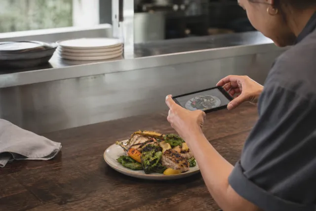
Choose your best-selling lunch combo, as served today. One overhead phone photo near a window, flash off, plate centered with a little table visible. This is your source of truth. Keep dish shape and portions truthful.
2. Crop for the thumb
Cut to 4:5. Keep plate at ~70% of frame, drink half out or out entirely, no hands, receipts, or trays. If the dish edge disappears, move closer instead of zooming. The same file has to survive a 200-pixel delivery thumbnail and a lunch menu block, so fill the frame with food, not table.
3. Calm the background
Plain matte table, soft daylight from the side, no harsh overhead yellow. Wipe the rim. One napkin max. If the room is busy, shoot the plate alone — context can come later in the menu layout. A calm background is not styling; it is legibility.
4. Generate the menu-ready version
In Studio, upload the anchor photo and paste the prompt below. Generate, then compare side-by-side: same dish, same portions, cleaner light and background. Keep 1 winner, discard the rest. If the generated version changes shape, color, or portion, reject it and re-run with stricter constraints.
5. Ship it where it earns
Use the winner in one place first: delivery listing cover + lunch menu block. Same file, same crop. Add preparation and price in text. Keep it for 14 days before restyling anything else. One stable image in two placements tells you whether legibility moved, without redesigning the whole menu.
What this demonstrates
What this demonstrates: a tighter, truer small-screen image lifts legibility without inventing food. If the generated version changes shape, color, or portion, reject it and re-run with stricter constraints.
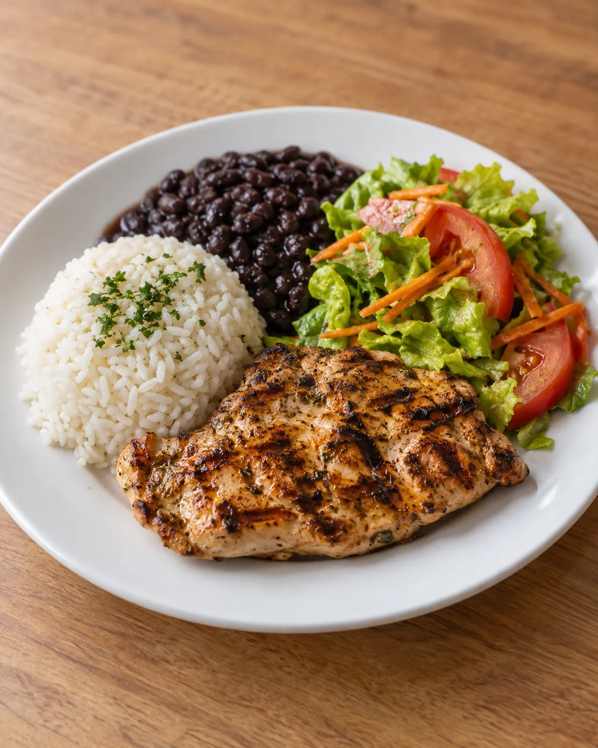
Generated example — final menu image made from a real phone photo with the prompt below. Dish kept truthful; background and light cleaned.
Editable reusable prompt
Copy this prompt into Studio, then change only the [bracketed] parts for your dish. It keeps subject, composition, light, viewpoint, background, and constraints separate so you can adapt one line at a time and judge the result against your source photo.
Subject: [grilled chicken lunch combo with rice, beans and salad], same dish and portions as source photo, no new items
Composition: centered plate at 70% frame, 4:5 crop, drink excluded, clean plate rim
Lighting: soft side daylight, natural white balance, gentle shadow, no flash glare
Camera viewpoint: 35-degree three-quarter overhead, sharp focus on main protein
Background: plain matte [warm light wood table], blurred, no people, no text, no logos
Constraints: keep true shape, color and portion size, photorealistic, menu-ready, do not beautify beyond real serving
Output: 4:5, high detail
Use it in Studio, then edit only [ ] parts for your dish.
Try it with one lunch photo
Have one lunch photo? Open FoodPhoto Studio and make 2 watermarked previews after verification — no card. Keep your source photo; compare before you publish.
Open FoodPhoto Studio with your anchor photo. When you are ready to compare plans, see current plans and usage estimates and read what FoodPhoto.ai does. For the wider workflow, see Restaurant Menu Photo Workflow: Phone Capture to Delivery App and the AI Food Photo Quality-Control Checklist before you publish.