● Guides · 8 min read
Why Food Photos Make People Order (and How to Apply It)
The psychology of food photography: the freshness, texture, portion, and trust cues that make people order — and a practical way to apply them to menu and delivery photos.

Great food photos are not just attractive — they change behavior. Understanding the psychology of food photography tells you exactly why one menu photo gets tapped and another gets scrolled past, and it turns out the levers are simple and repeatable. People order when a photo does two things at once: it removes uncertainty about what they will get, and it triggers appetite. This guide breaks down the four cues that drive "this looks worth it," and shows how to apply them to real menu and delivery photos.
The key takeaway: clarity reduces hesitation and freshness cues create craving — you need both, and you need them at thumbnail size.
The two jobs every food photo has to do
Before the four cues, understand the underlying mechanism. A customer scanning a menu or delivery feed is doing two things in parallel:
- Reducing risk: "What exactly am I getting? Is it worth the price? Will it match when it arrives?"
- Feeling appetite: "Does this make me want to eat it right now?"
A photo that nails appetite but leaves the customer unsure what the dish is will still lose the order. A photo that is perfectly clear but looks flat and lifeless does not create craving. Winning photos do both jobs simultaneously, which is why the cues below are not optional extras — they are how a photo earns the tap.
The 4 cues that drive "this looks worth it"
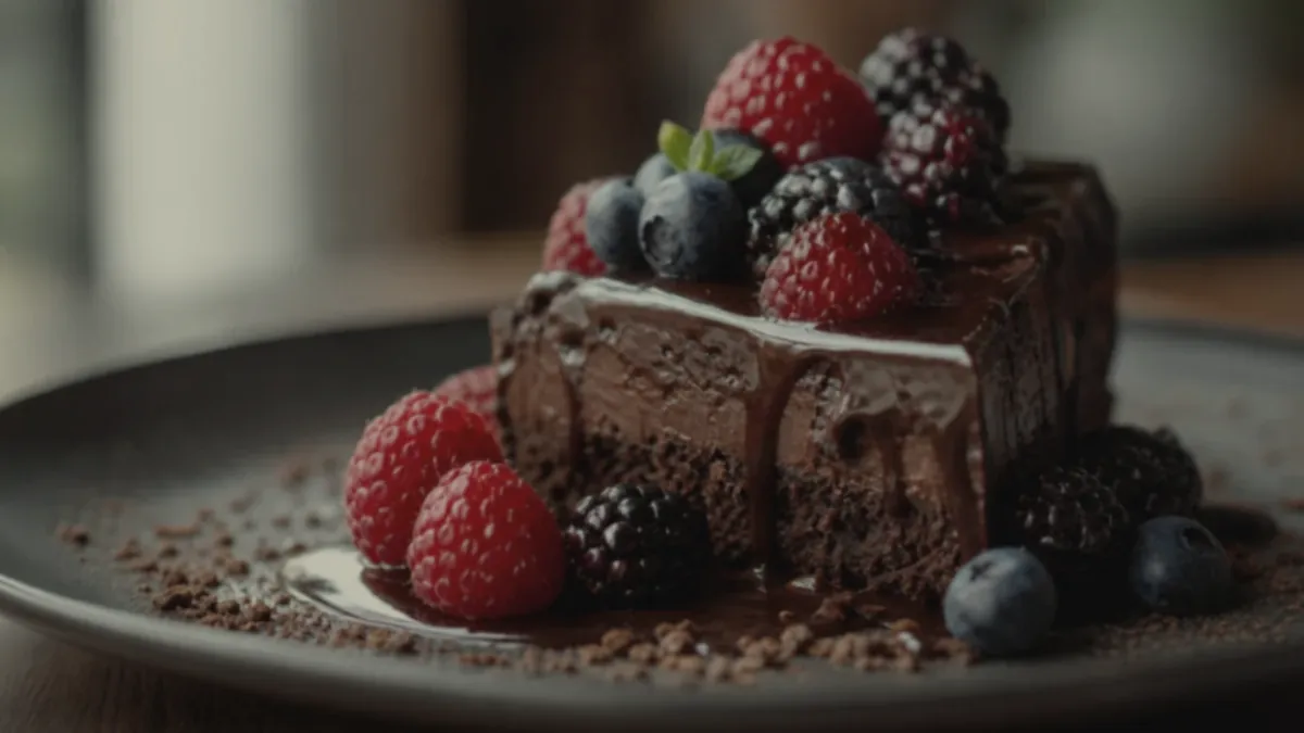
1) Freshness
Freshness signals quality and safety at a glance. The brain reads shine, steam, crisp edges, and vivid-but-natural color as "this was just made." To capture it, shoot quickly after plating before things wilt, melt, or dry out, and show texture and natural shine without burying it under heavy filters. Steam on a hot bowl, sheen on a glaze, and crisp lettuce edges all say fresh far more convincingly than any caption.
2) Portion clarity
Uncertainty about portion is one of the biggest reasons people hesitate, especially on delivery where they cannot see the food in person. Make the portion obvious: keep the plate or bowl fully visible, center the hero ingredient, and give the dish enough of the frame that its size reads clearly. When customers can see what they are getting, they stop second-guessing the price.
3) Texture
Texture is what lets people imagine the bite — and imagining the bite is most of the way to ordering it. Close shots of crisp edges, melted cheese pulls, layered ingredients, and sauce sheen do the heavy lifting here. This is why a tight texture crop often outperforms a polite full-table shot: it puts the sensory experience right in front of the customer.
4) Trust
Trust is the quiet cue that decides repeat orders. Accurate color and a consistent style across the menu signal a restaurant that has its act together, while a photo that over-promises produces "photo mismatch" complaints, refunds, and one-star reviews. On delivery apps especially, a bad first order often means no second order, so accuracy is not a constraint on conversion — it is part of it.
Why thumbnails change everything
Here is the cue most operators miss: customers almost never see your photo at full size. They see a small thumbnail, surrounded by competitors, scrolled past in a second. Every cue above has to survive that shrink.
That means the practical version of these principles is thumbnail-first: the dish fills the frame, the hero is centered, the background is simple, color is accurate, and texture still reads when the image is tiny. A gorgeous full-screen photo that turns into a dark, unreadable smudge as a thumbnail will lose to a simpler photo that stays clear. We go deep on this in delivery app photo optimization.
How to apply this in a real restaurant
Psychology only helps if it becomes a routine. The applied version is straightforward:
- Build a consistent station — one neutral surface, side light, and a reflector — so freshness and accurate color come standard.
- Batch shoot so the whole menu shares a look and reads as one trustworthy brand.
- Frame for portion clarity and texture — dish filling the frame, hero centered, plus one tight texture crop per key item.
- Enhance consistently for lighting, color, and cleanup — never to change the food.
- Export thumbnail-safe crops for every surface.
The full step-by-step is in our restaurant menu photo SOP, and the lighting that makes freshness cues land is covered in food photo lighting fundamentals.
How the cues map to real categories
The four cues are universal, but which one carries the most weight shifts by dish:
- Comfort food (burgers, fried, pizza): texture leads — melt, crunch, and steam do the persuading. Shoot tight and let the bite imagine itself.
- Fresh food (salads, bowls, poke): freshness and portion clarity lead. Vivid natural color and visible ingredients signal "made just now."
- Premium and fine dining: trust and consistency lead. Clean, accurate, restrained styling signals quality far better than heavy effects.
- Drinks and desserts: freshness cues like condensation, shine, and steam create instant craving, which is why these add-on items convert hard when shot well.
Knowing which cue your category leans on tells you what to emphasize in the frame instead of trying to maximize all four at once.
A simple way to test it
You do not need complex analytics to learn what your customers respond to. Change one variable at a time on a small set of items — a tighter crop versus a wider one, a cleaner background versus an in-restaurant one, a brighter edit versus a warmer one — and watch which version gets more orders over a couple of weeks. Changing one thing at a time is what lets you actually attribute the difference. Over time you build an evidence-based house style instead of guessing, and that style becomes the backbone of your restaurant menu photo SOP.
The honesty advantage
It is tempting to read "appetite cues" as "make it look better than it is." That backfires. The psychology cuts both ways: a photo that looks too perfect triggers skepticism, and a portion or ingredient that over-promises destroys the trust cue the moment the box arrives. The operators who win treat accuracy as the strategy — appetizing and true.
This is exactly what honest enhancement is for. It improves the lighting, color, background, and crop on a real photo of your real dish, sharpening every cue above without inventing food. You get the freshness, clarity, texture, and trust that drive orders, while the delivered dish still matches the picture. You can see the effect on a single photo with the FoodPhoto.ai.
Apply the four cues, shoot for the thumbnail, and keep it honest, and your photos will do what they are supposed to do: turn browsers into orders. When you are ready to bring the whole menu up to that standard, Get the Try Pack and review pricing.