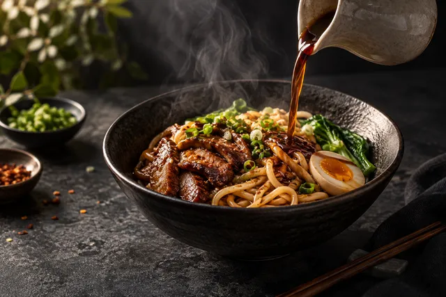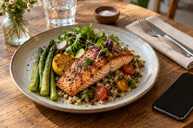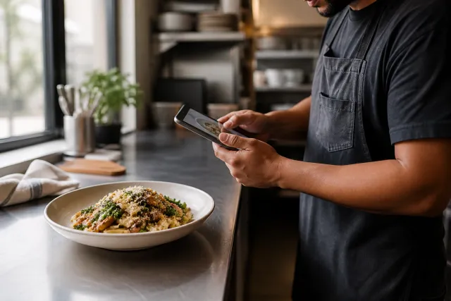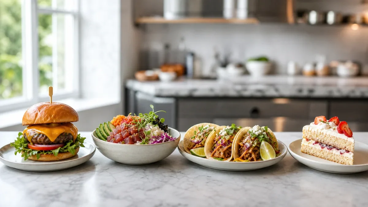
Restaurants often do not have a photography problem; they have a consistency problem. The menu may use tight overhead crops, Google may show dark phone snapshots, the website may use warm editorial images, and social may alternate between filters and unedited staff photos. Each image can look acceptable on its own while the collection feels like several different brands.
The short answer
Restaurant photo brand consistency comes from a small visual system that everyone can follow: define a primary crop, background approach, color and contrast range, plating-truth rules, export presets, review steps, and an archive structure. Use those rules across menu images, Google Business Profile, your website, delivery platforms, email, and social media. The goal is not to make every dish identical. The goal is to make every image clearly belong to the same restaurant.
This system can be lightweight. A one-page guide and a repeatable review checklist are usually more useful than a long brand document nobody opens during a menu update.
Why inconsistent food photos weaken a restaurant brand
Customers build expectations from visual repetition. When the same logo, colors, tone, and photography style appear repeatedly, the restaurant becomes easier to recognize and easier to trust. Inconsistent images create friction in several ways:
- Customers may wonder whether they are looking at the same restaurant across channels.
- A strong dish photo can make neighboring images look unusually weak.
- Different crops can hide important portions of a dish or make serving sizes appear inconsistent.
- Dramatically different color treatments can make food look like it comes from different kitchens.
- Old packaging, plates, tableware, or menu designs can make current listings feel neglected.
- Staff members may keep creating one-off assets because there is no agreed standard.
Consistency also helps operations. When the rules are clear, a manager can approve a photo without debating personal taste every time. A designer can resize an image without starting over. A marketing team can refresh a menu without accidentally changing the restaurant’s visual identity.
Define the visual system before editing images
Start by writing decisions that can be followed quickly. For most restaurants, seven areas cover the practical basics.
1. Crop and composition
Choose one primary composition for menu and delivery images. A centered three-quarter view often works well for plated dishes because it shows depth and recognizable ingredients. An overhead crop may suit bowls, pizzas, family meals, or flat-lay promotions. The right choice depends on the dish and channel, but the rule should be intentional.
Record:
- Primary angle: overhead, three-quarter, or side view.
- Subject position: centered, slightly offset, or aligned to a grid.
- Safe area: space reserved for platform overlays or social text.
- Thumbnail test: whether the main dish remains recognizable at a small size.
- Exceptions: dishes that need a different angle to show their defining feature.
Do not force a single crop onto every dish. A tall burger stack, a wide pizza, and a small dessert may need different framing. Keep the visual logic consistent even when the exact crop changes.
2. Background and surfaces
Choose a small surface family rather than one background for every image. For example, a restaurant might use warm neutral stone for core menu images, dark wood for evening promotions, and a clean light surface for catering or breakfast content.
Keep the following stable:
- Background color range.
- Surface texture and reflectivity.
- Prop policy.
- Amount of visible negative space.
- Relationship between dish and background contrast.
Props should support the restaurant’s identity and the dish. If one image includes cutlery, napkins, herbs, and branded packaging while the next uses a bare studio background, the difference should be a deliberate content category rather than an accident.
3. Color and contrast
Color correction should make the food look appetizing and believable. It should not turn every dish orange, increase saturation until ingredients look artificial, or make shadows so deep that customers cannot understand the plate.
Set a practical range for:
- White balance.
- Highlight brightness.
- Shadow detail.
- Saturation.
- Contrast.
- Skin or packaging colors where people appear in the frame.
A useful test is to compare a dish with the real item in the kitchen. If the photo promises a color, garnish, texture, or portion that the customer will not receive, the edit has gone too far. Honest enhancement can improve light and clarity while preserving what is actually served.
4. Plating truth
Visual consistency must not come at the expense of trust. Decide what may be adjusted and what must remain accurate.
Usually acceptable:
- Correcting exposure and white balance.
- Reducing distracting background elements.
- Cleaning up minor smudges or sensor artifacts.
- Improving crop and visual balance.
- Making the background consistent.
Requires careful review:
- Changing garnish quantity.
- Adding steam, sauce, cheese, or ingredients.
- Enlarging a portion.
- Replacing a side dish.
- Altering the shape or texture of the food.
- Removing an ingredient that customers normally receive.
If an image needs major changes to look appealing, it may be better to reshoot or photograph the dish in a more suitable way. Your photo system should help the food look like the food, only clearer and more consistently presented.
5. Export presets
Create channel-specific presets so teams do not repeatedly make technical decisions. Platform requirements can change, so treat presets as working defaults and check current marketplace rules before a major upload or campaign.
| Use case | Visual priority | Preset guidance | Review question |
|---|---|---|---|
| Website menu | Clarity and fast loading | Consistent aspect ratio, web-compressed file, descriptive filename | Is the dish clear on desktop and mobile? |
| Delivery menu | Thumbnail recognition | Strong subject separation, readable crop, platform-accepted format | Does it remain recognizable at small size? |
| Google Business Profile | Brand impression | Balanced crop, accurate color, current dish or space | Does it represent the restaurant today? |
| Instagram or social | Story and variety | Flexible crop with room for text where needed | Does it fit the feed without breaking the system? |
| Email or promotions | Offer emphasis | Channel-appropriate dimensions and safe text area | Is the dish still the visual focus? |
Use descriptive filenames such as restaurant-name-dish-name-menu.jpg rather than camera defaults. Add useful alt text on owned web pages, especially where the image communicates menu information.
6. Review and approval
Assign one person as the final visual reviewer, even if several people create or upload assets. Approval should be based on the written system rather than whoever has the strongest personal preference.
A fast review can ask:
- Is this definitely the current dish?
- Is the portion and plating truthful?
- Does the crop match the channel?
- Is the light within the brand range?
- Does the background belong to the correct image family?
- Is any ingredient, garnish, or packaging misleading?
- Is the file named, exported, and archived correctly?
Keep approved references in a shared folder or library. A team member should be able to compare a new image with two or three approved examples in under a minute.
7. Archive management
A photo system breaks down when old and new assets are mixed together. Organize images by status and purpose, not only by date.
A simple structure might include:
01_current-menu02_google-and-website03_delivery-platforms04_social-campaigns05_pending-review06_archive07_rejected-or-do-not-use
Include the dish name, version, date, and status in filenames or metadata. When a dish changes, archive the old version instead of overwriting it. This preserves a record of what was published and prevents a retired image from returning through an old campaign folder.
Build a one-page restaurant photo style guide
Your guide does not need to be elaborate. It should answer the questions that cause repeated inconsistency.
Include:
- The purpose of the photo system.
- Three to five approved reference images.
- Primary and secondary crop rules.
- Background and prop rules.
- Color and contrast boundaries.
- Plating-truth requirements.
- Export presets and filename format.
- Review owner and approval status.
- Archive location.
- A short list of prohibited edits.
Write rules in observable language. “Make it premium” is difficult to approve consistently. “Use soft directional light, moderate contrast, neutral backgrounds, and visible texture in dark ingredients” is easier to apply.
A practical consistency checklist
Use this checklist before publishing or updating a group of restaurant images:
- Every image shows the current dish, packaging, or restaurant space.
- The crop works for the destination channel and its thumbnail view.
- The background belongs to an approved surface or image family.
- White balance and color feel consistent across the set.
- Shadows retain enough detail to show the food clearly.
- Portions, ingredients, garnishes, and packaging are truthful.
- No accidental props, stains, reflections, or unrelated labels distract from the subject.
- Files use the agreed naming convention.
- Web images are compressed appropriately.
- Alt text is useful where the image is published on an owned website.
- A reviewer has approved the final set.
- Superseded files have been moved to the archive.
- Current platform rules have been checked before upload.
For a detailed production process, connect this guide to your restaurant menu photo SOP. The SOP can explain who captures, edits, reviews, and uploads images, while this playbook defines what the finished images should feel like.
Use channel families instead of one universal image
A common mistake is to create one image and force it into every placement. A better approach is to maintain a shared visual system with channel-specific adaptations.
Your website may support a wider image and more context. A delivery app may need a tighter crop so the dish survives a small thumbnail. Google may benefit from a current, inviting image that shows the dish or dining experience clearly. Social content can include more variety, motion, people, or behind-the-scenes material while still using the same color and truth rules.
The identity comes from the repeated decisions, not from identical dimensions. Use the same visual foundation, then adapt composition to the job each channel must perform.
Create a refresh and archive rhythm
Do not wait until every image looks outdated. Set a manageable review rhythm based on menu changes and customer-facing priorities.
A monthly check can review new dishes, discontinued items, broken links, and obvious mismatches. A quarterly review can compare the active library across menu, Google, website, social, and delivery platforms. A larger refresh can follow a menu redesign, rebrand, packaging change, new location launch, or major seasonal shift.
Use the restaurant photo refresh calendar to assign review windows and avoid last-minute image work. The important point is ownership: someone must know which images are current, which are approved, and which should no longer be used.
Where FoodPhoto.ai fits
If you already have real dish photos or phone captures, FoodPhoto.ai can help standardize the production layer. Restaurant owners can upload their source images and use the workflow to improve light, clean up backgrounds, create more consistent crops, and export menu-ready versions.
The right expectation is enhancement, not fantasy. Start with a real dish and verify the result against what the kitchen serves. Keep meaningful ingredients, portions, textures, and packaging accurate. If the source image cannot support a truthful result, flag it for a new capture instead of asking an editor to invent a better dish.
This approach is especially useful when a restaurant has many images that were captured by different people under different conditions. It can reduce avoidable variation while leaving the final brand decisions with the operator.
You can explore the AI menu photo workflow and compare the available pricing options for a small menu refresh or a broader image system.
Final takeaway
Restaurant photo brand consistency is a governance habit, not a special filter. Define a few clear rules for crop, background, color, contrast, plating truth, exports, review, and archiving. Apply them across channels, adapt the crop to each placement, and keep the library current.
When every image feels like it belongs to the same restaurant, customers spend less time interpreting the brand and more time deciding what to order. Start with five representative dishes, document the rules, approve the references, and use that small system to guide the next menu refresh.
Ready to make your restaurant images more consistent? Start with real dish photos, try a FoodPhoto.ai menu refresh workflow, and review the options on the pricing page.
FAQ
What does restaurant photo brand consistency mean?
Restaurant photo brand consistency means using repeatable visual rules for crop, background, lighting, color, plating, export settings, and review so customers recognize the same restaurant across every channel.
Should every restaurant food photo look identical?
No. Photos should feel related, not duplicated. Keep core rules consistent while allowing enough variation for different dishes, campaigns, seasons, and formats.
Can AI help create consistent restaurant photos?
Yes. AI can help normalize light, backgrounds, crops, and exports from real dish or phone photos. The process should preserve the dish accurately rather than inventing ingredients, portions, or garnishes.
How often should a restaurant review its photo library?
Review the active photo library at least quarterly and whenever the menu, packaging, brand identity, or major sales channel changes. A small monthly check can catch obvious inconsistencies sooner.
Next step
Choose one real dish photo, enhance it, and compare the before/after at delivery-app thumbnail size. If it still looks like the dish your kitchen serves, use the same standard across the rest of your menu.
Enhance real menu photos with FoodPhoto.ai
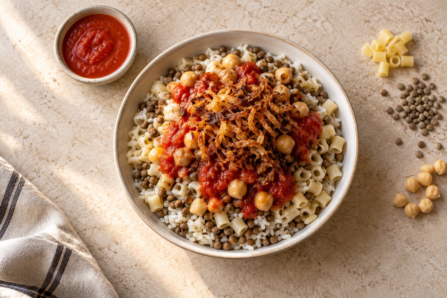
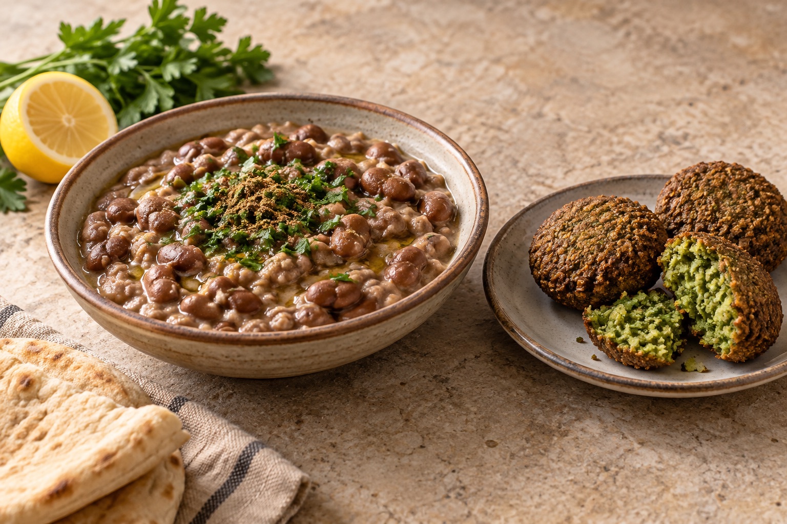
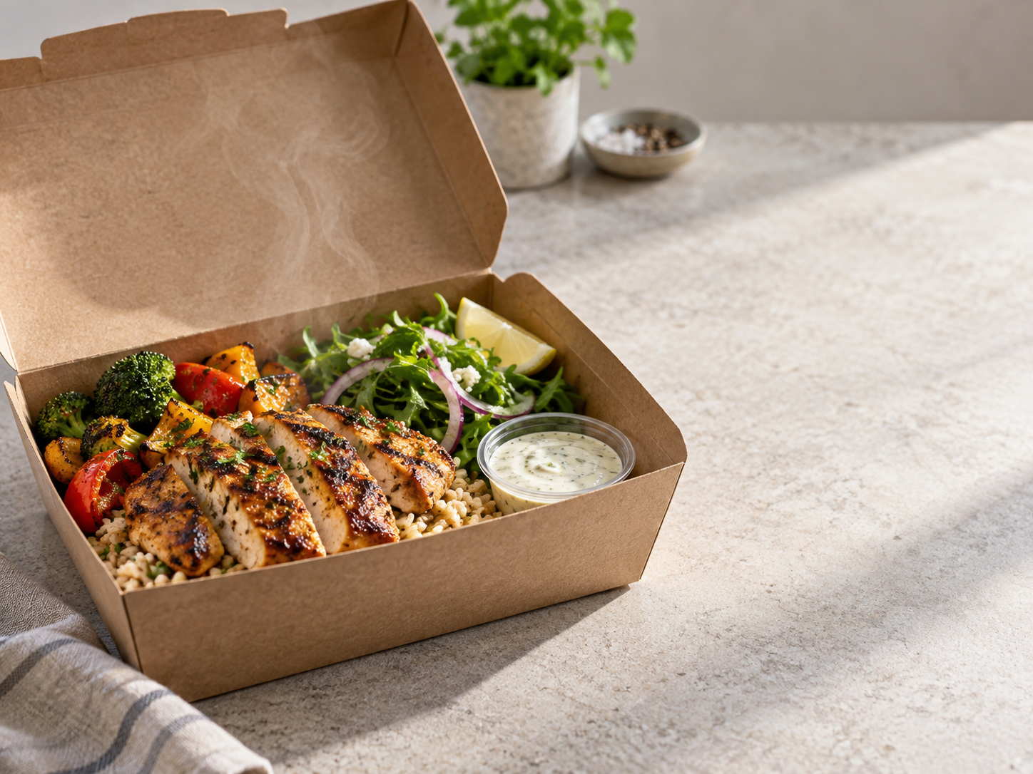
Worked example: repeat one background across two dishes
Use this shared brief: warm neutral stone, soft light from the left, natural food color, simple ceramic dishes and enough margin for the destination crop. Keep the background constant; choose overhead when it explains layers and a three-quarter view when it explains height.
Pixelcut or FoodPhoto for the background job?
| Task | Pixelcut’s published workflow | FoodPhoto’s current workflow |
|---|---|---|
| Replace a background | Solid color, your image or a prompted scene; cutout and shadow controls. | Start from your dish and reuse a brief or one of 133 photo styles. |
| Make a consistent set | A bulk background tool applies a common setting across product images. | Review dishes individually, then build menus and campaigns with 59 marketing styles. |
| Choose what to check | Inspect cutout edges, shadows and the actual source portion. | Inspect ingredients, portion, text and crop after every edit. |
These are published workflow capabilities, not measured superiority. Sources checked October 2, 2026: Pixelcut background changer, Pixelcut bulk workflow and FoodPhoto’s current catalog. FoodPhoto includes two lifetime watermarked previews for a verified account; paid usage varies with the model and attempts.
Keep authentic originals for channels that prohibit generated submissions. See the Wolt guide, delivery-only menu workflow, FoodPhoto Studio and current plans.